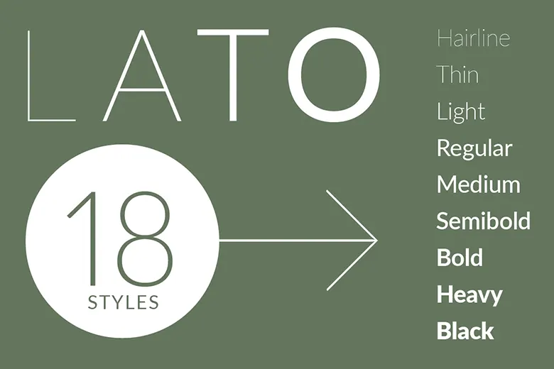
Lato Font Family
Łukasz Dziedzic designed Lato in 2010 with a focus on both warmth and functionality. Originally intended for corporate branding, its

Łukasz Dziedzic designed Lato in 2010 with a focus on both warmth and functionality. Originally intended for corporate branding, its
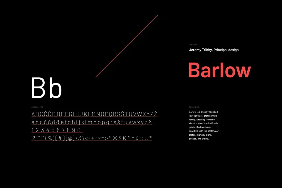
Jeremy Tribby designed Barlow as a versatile, slightly rounded grotesk typeface. Inspired by California’s public signage, it reflects the bold,
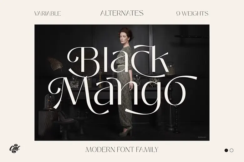
Black Mango is a modern and simple font family with nine weights and dozens of alternates. Its versatility makes it
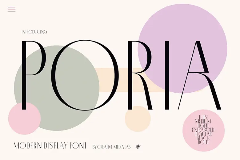
Poria is a sleek and modern font with seven weights, elegant alternatives, and unique monogram ligatures. Its standout feature is
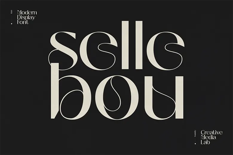
Sellebou is a modern display font with three weights: Display, Regular, and Text. Its mix of straight lines and subtle
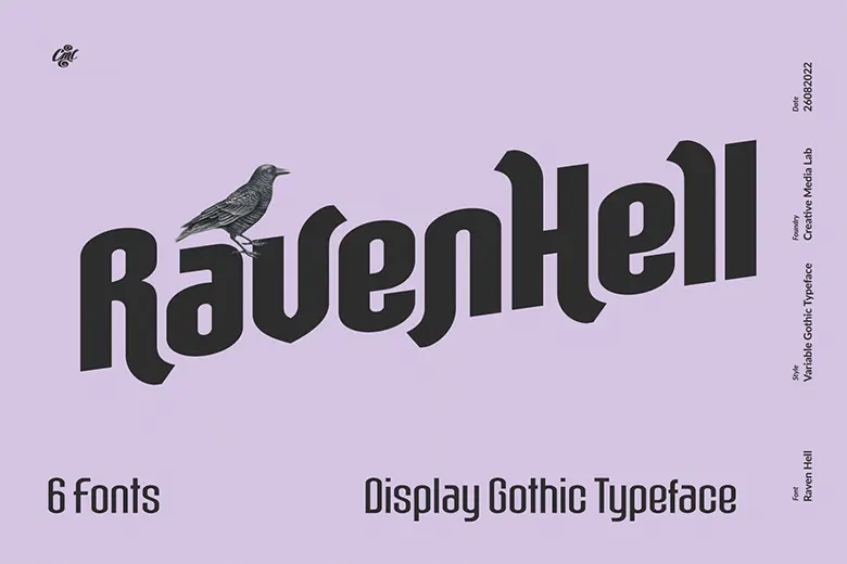
Raven Hell is a simple, gothic-inspired sans-serif typeface. It includes six styles from Thin to Black, plus dozens of alternates.
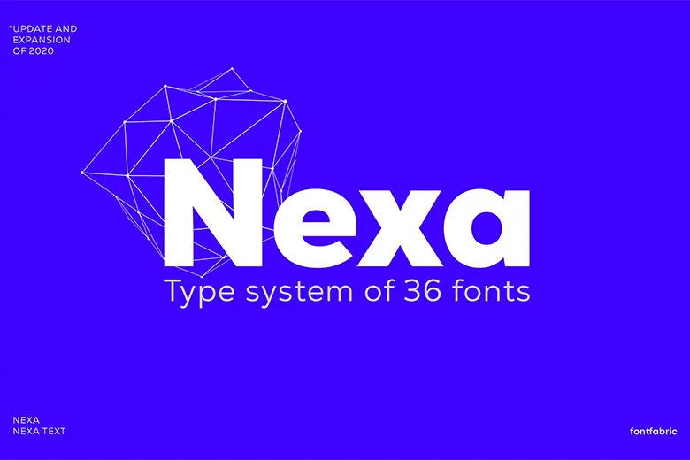
Nexa Font Family by Fontfabric offers 36 fonts across 9 different weights. It provides excellent readability for web, print, and
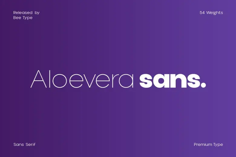
Aloevera is a display typeface with 54 variations. Ideal for logos, magazines, movies, and posters, it provides a bold and
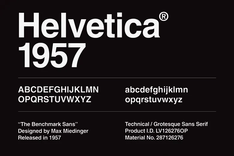
Helvetica is a famous sans-serif font designed by Max Miedinger and Eduard Hoffmann in 1957. First called Neue Haas Grotesk,
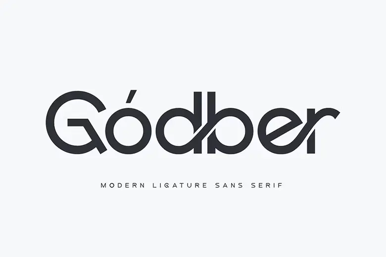
Godber is a strong, modern font built for bold designs. Its sleek, minimalist aesthetic makes it great for logos, headlines,

Futura is a geometric sans-serif font that dates back to the 1930s. Unlike many other sans-serifs, it’s got a low
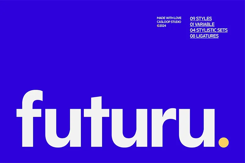
Futuru is a modern sans-serif with a clean, geometric style. Inspired by classic neo-grotesque fonts, it offers excellent readability and