Nourd Font Family
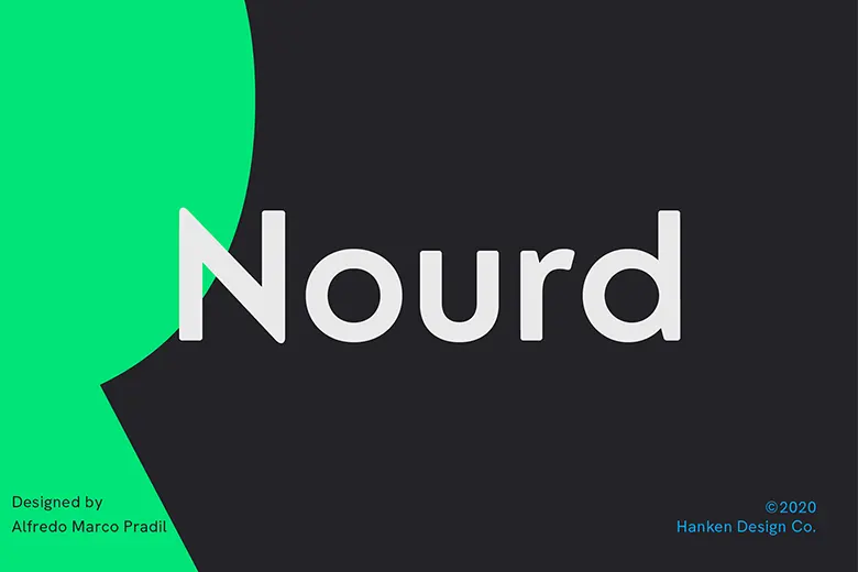
Alfredo Marco Pradil designed Nourd in 2012, publishing it with Hanken Design Co. This versatile typeface features six styles, ranging

Alfredo Marco Pradil designed Nourd in 2012, publishing it with Hanken Design Co. This versatile typeface features six styles, ranging
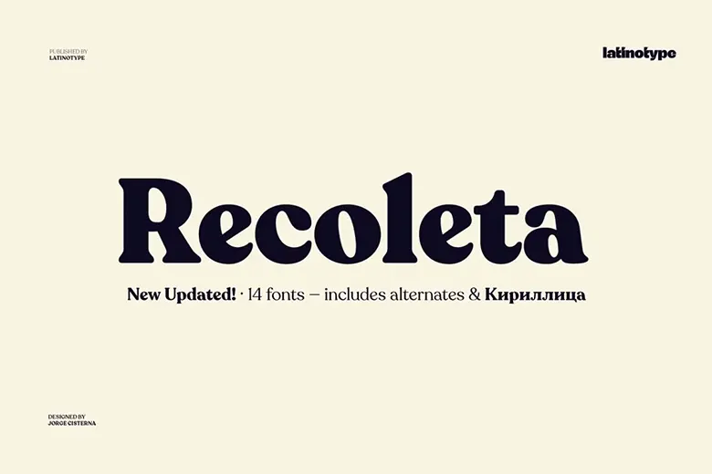
Recoleta draws inspiration from 1970s typefaces like Cooper and Windsor. Its soft curves and angled strokes create a familiar yet
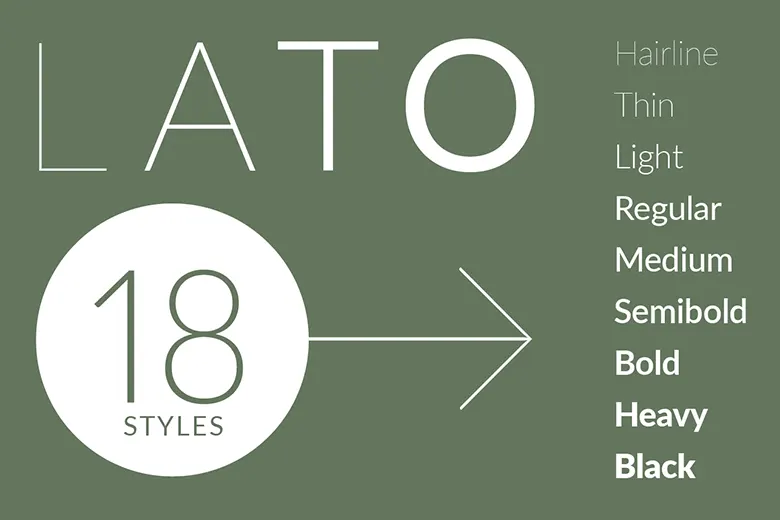
Łukasz Dziedzic designed Lato in 2010 with a focus on both warmth and functionality. Originally intended for corporate branding, its
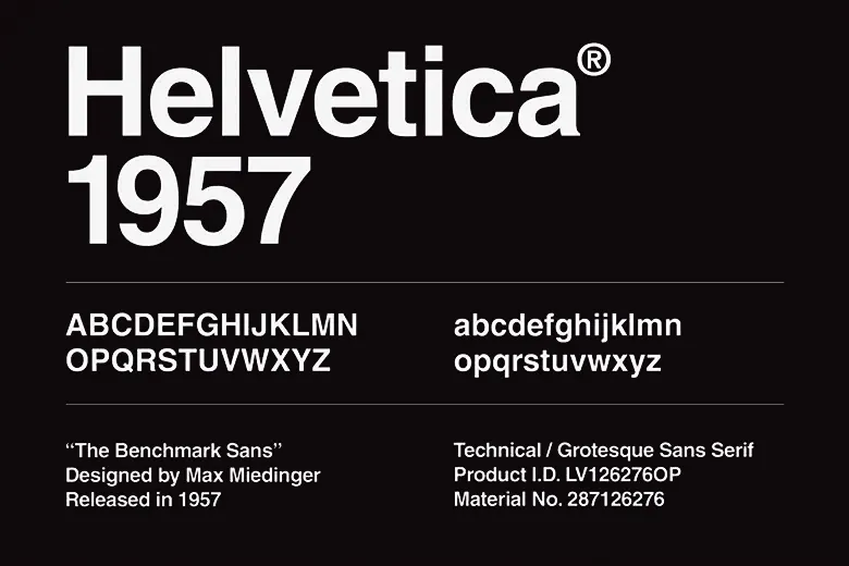
Helvetica is a famous sans-serif font designed by Max Miedinger and Eduard Hoffmann in 1957. First called Neue Haas Grotesk,
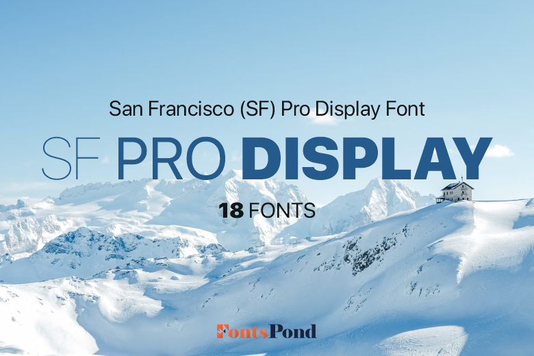
Apple designed San Francisco for clear and consistent readability across all devices. It adjusts dynamically to different screen sizes and
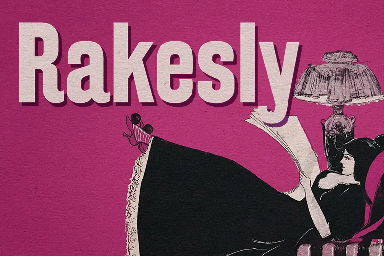
Rakesly font blends late 19th and early 20th-century sans-serif styles with modern elegance. The upright version highlights the best features
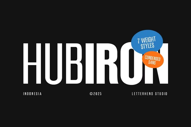
Hubiron is a bold, condensed sans-serif font designed to make a strong impact. Its tall, narrow letterforms give it a
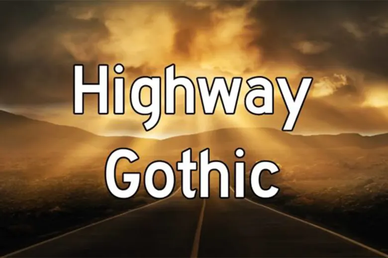
Highway Gothic stands out as a stunning sans-serif font. Its well-balanced characters work well in a variety of designs. Adding
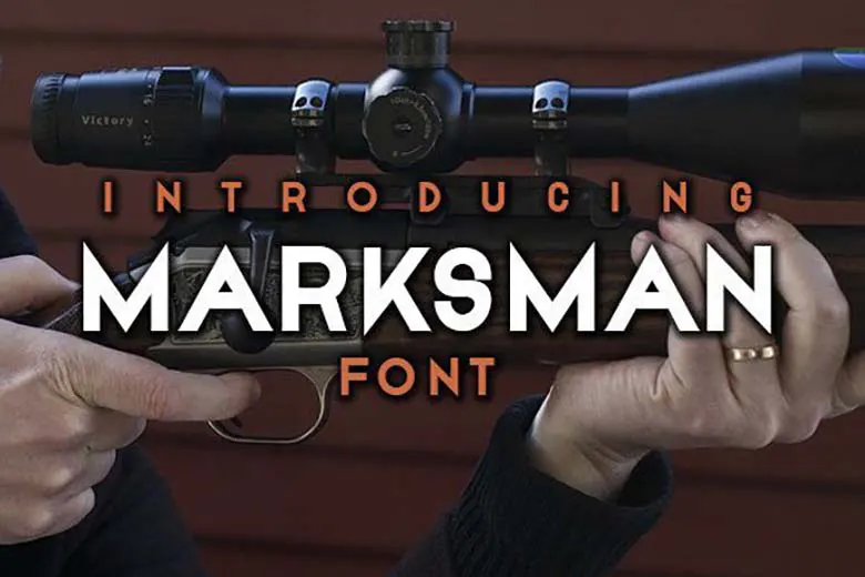
Marksman is a clean and modern sans-serif font that stands out. Its bold design makes it perfect for posters, flyers,
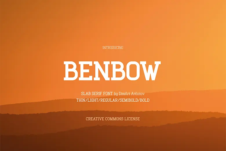
Benbow is a slab serif font that combines strength with refinement. Its rectangular serifs give it a solid, confident feel,
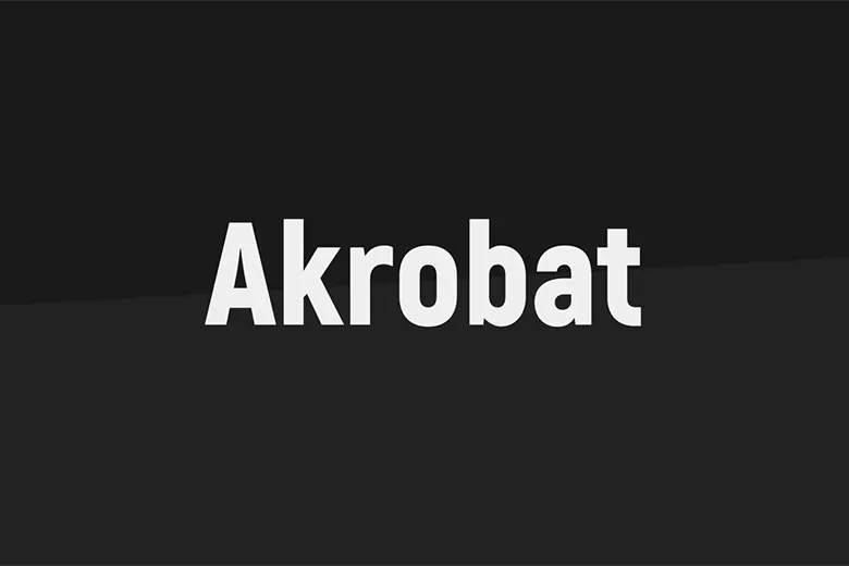
Akrobat is a modern sans-serif font with narrow proportions and a clean design. It features geometric shapes and a touch
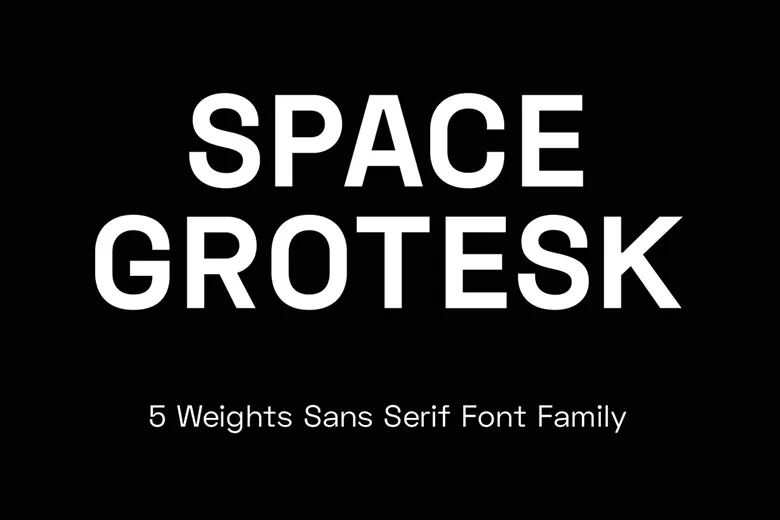
Space Grotesk is a proportional sans-serif font inspired by Colophon Foundry’s Space Mono (2016). Florian Karsten designed it in 2018,